JERSEY DESIGN
Soccer Jersey Number Font: Choose Legible Lettering for Your Kit
A good soccer jersey number font is readable while the player moves, fits the available back panel, and satisfies the competition’s number rules. Start with clear digits and high contrast, then check actual-size 1, 7, 8 and two-digit samples on the shirt. Licensing and print method matter before the artwork goes to production.
By bootswave Editorial ·

Choose for recognition before style
The number is an identifier, not merely decoration. A spectator, teammate or official should be able to tell 3 from 8 and 1 from 7 when the player is moving. A display font may look distinctive in a design file but become hard to read after a transfer is reduced, placed over a textured panel or seen from the far touchline. Start with the physical job: quick recognition at normal playing distance.
Print a few candidate digits at the size your league requires or your team plans to use. Include 1, 7, 3, 8, 0 and 9, plus common pairs such as 11, 17 and 88. These reveal narrow strokes, closed counters and pairs that crowd each other. Ask several people to read the proof at a distance while someone moves it; a static desktop view is incomplete. If readers hesitate or disagree, simplify the lettering, increase the permitted size or improve contrast. Do not invent a universal viewing distance; use your competition's rule and the reality of your venue.
For scope, UEFA's 2026 Equipment Regulations require shirt numbers in its competitions to be legible to officials, spectators and TV viewers from at least 50 meters, and specify a stroke width and height. That is a professional competition specification, not a blanket youth or U.S. league rule. Your organizer may use different dimensions or approve a standard number set.
Check the rulebook before selecting a typeface
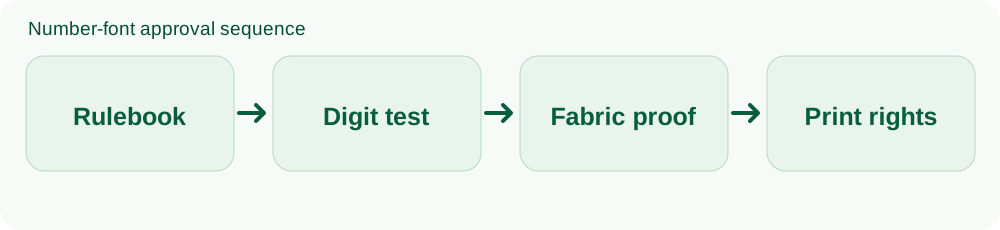
Some competitions specify a font, number placement, allowed colors, outlines, sponsor separation or whether a name is required. Others simply require a readable number. Ask for the current written rulebook, especially for a school tournament or multi-venue league. The person placing the order should keep a copy of the approved artwork, because later replacement shirts need to match.
IFAB Law 4 allows a player's number on equipment subject to competition rules; it does not publish a universal downloadable jersey number font. UEFA's rule, by contrast, is detailed: numbers in its covered competitions must contrast with the number zone and have a defined height and stroke. Even then, a compliant template on a computer can fail if the final applied print is distorted or masked by a patterned shirt.
| Question | Why it matters | What to verify |
|---|---|---|
| Is a font mandated? | Custom lettering may be rejected | League or organizer's current guide |
| How large must digits be? | Attractive type may not fit the allowed zone | Printed number dimensions |
| What colors and effects are allowed? | Outline or two-tone treatment may be restricted | Number-zone contrast and approval |
| Are names required? | Long names can crowd the upper back | Name rules and layout |
Our number-size guide deals with measurement. This article focuses on selecting letterforms and checking the finished print. Keep those decisions connected but separate: a correctly sized unreadable font is still a poor choice.
Look at digit shapes, spacing and stroke weight
Choose digits with clear internal openings, often called counters. In a small 8, the two openings can close when printed; a 3 can become a thick curved block; a 9 can resemble a 0 if its tail is too short. Check the number 1: is it a straight bar that disappears beside a seam, or does it have a distinctive head and base? Check 7 against 1 in your proposed font. There is no single correct serif or sans-serif answer; the goal is to reduce ambiguity in this use.
Strokes that are too thin can disappear against textured fabric, while very heavy strokes close the spaces inside digits. Outline effects can improve a number on some backgrounds but make the silhouette visually noisy on others. Test the exact effect at print size. UEFA's regulation allows specific outlines and key lines in its competition, but says decorative treatment cannot undermine legibility. Do not assume a complex shadow is permitted in your league just because an elite team's shirt uses one.
Spacing changes as much as shape. Put 11, 18 and 88 on the same proof. A font that looks fine as a single 8 may squeeze two wide digits into a single dark rectangle, or spread two narrow 1s so far apart they look disconnected. Place the proof on the real back panel, including seams, sponsor location and the widest and smallest shirt sizes. A single adult-size mockup may not represent the youth kit.
Color and shirt pattern can erase a good font
Try the same print color on every shirt color and on the actual back panel. A bright white number may read clearly on navy but disappear on a pale yellow alternate. A dark number can merge with a shaded pattern even if the average shirt color seems light. A solid color panel or controlled number zone may help, but check whether the competition permits it and how it looks after production.
For UEFA competitions, the regulations even define objective contrast measurements for number zones and numbers. Article 54 sets Delta L thresholds measured with a spectrophotometer. A grassroots team is unlikely to perform that laboratory check, so a real-size sample under field lighting is a practical screen; it is not a substitute for official approval where the rule applies. Photographs can help identify a weak contrast, but camera exposure and screens can alter the apparent colors.
View the shirt from front, back and both sides on a person. A number hidden by a crease, jacket or hair is not primarily a font issue, but placement and print area can often be improved. Avoid placing a number over a strongly raised seam or a region with mesh texture that may affect transfer adhesion. Ask the print provider which placements and materials it has tested on that exact garment.
Confirm rights and production before sending artwork
A font file downloaded for free is not necessarily licensed for commercial printing on jerseys. Read the font's license: personal use, team use, paid merchandise and embedding or modification can have different terms. If you want to imitate a famous club's distinctive lettering, check trademark and design rights as well as the font license. A generic athletic typeface is often simpler to clear than a near-copy of a protected kit identity. This is a production check, not legal advice about a specific font.
Ask the printer whether it needs outlined vector artwork, a particular file format, or a supplied number set. Outlining turns editable text into shapes, which helps preserve the appearance when the printer does not have your font installed; keep the original editable file separately. Tell the printer the exact garment material and decoration method. Heat-transfer application has its own temperature, pressure and wash-care constraints, so do not reuse an application recipe from a different material.
Before printing a roster, approve one actual shirt with a single digit, a two-digit number and the longest expected name. Check edges, spacing, contrast and comfort after the garment is worn and washed according to its care label. If the shirt is personalized, returns may be limited; resolve errors at proof stage. Save the final approved files and number list so replacements match the original batch.
A short approval checklist for teams and individuals
- Get the rules: Save the organizer's current number requirements and any approved font or template.
- Compare candidate digits: Print ambiguous shapes and double-digit pairs at real size.
- Test the actual shirt: Use the real fabric color, pattern, size and planned placement.
- Confirm permission: Check the typeface's use rights and the team's logo or name rights.
- Approve a sample: Sign off on a finished shirt before printing every name and number.
For a single casual jersey, you may not need a league's technical approval, but legibility and print rights still matter if you are commissioning a custom shirt. For an organized team, send the proof to the competition if its process requires approval. The designer, printer and coach should agree on one final file rather than making separate last-minute changes.
Common questions
Is there one official soccer jersey number font?
No universal font is set by IFAB. Specific competitions or clubs may prescribe typefaces, so check the relevant organizer's rules and permissions.
Can I use a free font on team shirts?
Only if its license covers the planned use. Read the license and confirm with the print provider; “free download” alone is not permission for merchandise.
Will a larger number fix a hard-to-read font?
Sometimes size helps, but ambiguous digit shapes and weak contrast can remain problems. Test a different font and color on the real shirt.
The practical decision
Choose the simplest font that remains distinct at match distance, in the sizes and colors your competition allows. Approve its use rights and a finished sample before printing a roster. Style can follow; readability is the reason the number exists.
Sources and scope
- UEFA Equipment Regulations 2026, Article 10: Numbers
- UEFA Equipment Regulations 2026, Article 54: Color contrast measurement
- IFAB Law 4: The Players’ Equipment
This guide combines published competition rules and editorial decision steps. It is not a hands-on test of a particular bootswave product. Check the rules for your own competition before ordering.
Ask about a product
You can ask about one pair or one jersey. Tell us the style, size, delivery country and your question; we can confirm options and price. Message bootswave on WhatsApp or use this form.
Published: · Updated:
