
TEAM KIT DESIGN
Soccer Jersey Colors: Choose a Kit Players Can Tell Apart
Choose soccer jersey colors by contrast on the field, not by a screen swatch alone. Prepare a clear light and dark option, check the goalkeeper and referee colors, and test how the full shirt, shorts and socks look beside likely opponents. League rules and accessibility can change which attractive design actually works in a match.
By bootswave Editorial ·

The basic rule is distinguishability
IFAB Law 4 says the two teams must wear colors that distinguish them from each other and the match officials. Goalkeepers must also be distinguishable from other players and officials. That is the starting point, not a complete color chart for every youth league. Your competition may specify who changes when colors clash, whether numbered bibs are allowed, or whether an alternate kit must be available. Ask before approving a team-wide order.
Compare the whole kit. Two shirts that look different on a laptop may be harder to separate when one team has matching shorts and socks and the other does not. The view from the touchline is different from a close-up catalog photo. Place sample shirts side by side at a distance, under daylight and the lighting your facility uses. If the colors are only distinguishable when you read the crest, they are not doing enough work for quick play.
The goalkeeper should not disappear into either outfield side. A bright keeper shirt can still be too close to an opponent's bright kit or the referee's shirt. If you are choosing for an entire club, plan the keeper colors at the same time as outfield shirts rather than treating them as an afterthought.
Build a light and dark plan before choosing exact shades
For many teams, the simplest robust plan is a substantially light home option and a substantially dark alternate. Football color-vision guidance prepared with the FA and UEFA recommends this approach because colors with different names can look similar to people with color-vision differences. A second kit that merely swaps navy for black may look new to the designer but fail to solve a dark-versus-dark clash.
Choose each kit as a set: shirt, shorts, socks, number print and keeper shirt. Put the proposed sets beside the colors common in your league. List a couple of realistic fixtures: your blue shirt versus a dark purple opponent, and your white shirt versus a pale gray opponent. If both can cause trouble, your alternate plan needs another option. A practice bib may solve a casual session; a competition may not permit it or may require a numbered, approved shirt.
| Choice to test | Useful question | Warning sign |
|---|---|---|
| Home and alternate shirts | Are they clearly light versus dark? | Only the hue changes; brightness stays similar |
| Shorts and socks | Can players identify a teammate's legs in motion? | Both teams use the same dark lower half |
| Goalkeeper shirt | Does it differ from both teams and officials? | It resembles a field player's alternate |
| Numbers | Can they be read over the back pattern? | Same-tone print on a busy design |
These checks do not prescribe one universal pair of colors. Your own competition has the final say on approval and match-day resolution. The UEFA professional kit rules, for example, allow officials to request combinations of approved items to create contrast; that is a scoped competition rule, not a blanket instruction for school teams.
Test the design for color-vision differences
Color blindness is one reason a red kit and green kit can be hard to distinguish even if people with typical color vision see an obvious difference. The FA/UEFA guidance highlights other risky combinations, including similar tones and colors that blend with the pitch. It suggests looking at proposed shirts through a grayscale or monochrome phone setting as a quick screen. That is a useful warning test, not a medical simulation or an official approval method.
For a practical check, photograph the complete sample kits under the lighting of an actual field, then view them in grayscale at normal phone size. If the outfield shirts converge into the same lightness, choose a more distinct alternate. Ask players who have difficulty distinguishing colors whether the kits are clear in motion. Do not rely on one observer's experience as a guarantee for everyone; use contrast in lightness and, where appropriate, contrasting patterns or trim as additional cues.
A tiny stripe on a sleeve may vanish at distance. A large contrasting panel can help, but patterns should be evaluated from both front and back. A dark shirt with bright shoulders may still look mostly dark from behind, where a teammate often sees it during play. Conversely, a goalkeeper's jersey with a bright front and dark back can look different as they turn. Check all angles on a person, not just a flat design.
Make names and numbers part of the color decision
A kit can pass the team-versus-team test yet fail when the number disappears into its background. Put the proposed number color and typeface on an actual sample or a full-size print proof. Inspect single- and double-digit examples, especially shapes that can be confused at a glance. A solid number panel may help on an irregular pattern, but it changes the design and may be required or restricted by a competition. Number size is a separate specification; neither size nor color alone guarantees readability.
Match the print to the physical textile, not just a digital RGB code. Fabric, dye, lighting and transfer material affect what the final color looks like. Ask for a print proof with a realistic back view, ideally on the exact fabric and base color. Check white on pale yellow, black on dark blue and any tonal combinations especially carefully. If you are ordering many sizes, check how the number zone scales on youth and adult shirts.
Names may matter for a particular league or event, but they should not weaken the required player number. If the font is highly decorative, test the longest name and a two-digit number together. Our number-font guide covers that legibility decision in detail.
A simple team approval workflow
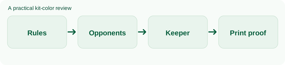
- Read the competition rules: Record home, alternate, goalkeeper, number and accessory requirements, including approval deadlines.
- Map likely clashes: Compare your proposed sets with the teams you regularly face and the usual officials' colors.
- Review accessibly: Use a grayscale check, examine both sides and ask whether players can distinguish shirts in motion.
- Request a sample: Inspect actual fabric and printed number under field lighting before mass production.
- Keep a match-day plan: Know which alternate set is available and who is responsible for bringing it.
Keep a photo and note of the approved combination, including shorts and socks. A later replacement batch can drift in shade or print color; comparing against the approved sample helps catch a mismatch. If ordering for youth teams, include sizes and any goalkeeper variants in the proof. Our jersey-making guide covers the broader design and production steps.
An individual buying one fan jersey has a different decision: choose a color you like and check wash care and authenticity. The full-kit approval process matters when shirts will be used in organized play. Avoid presenting league requirements as a reason that a casual shopper cannot wear a certain color.
Common questions
Must every team own a home and away kit?
That depends on the competition. A strongly contrasting alternate is a sensible plan, but check your league's actual requirements before ordering.
Are red and green kits always banned against each other?
No universal ban follows from IFAB Law 4. They can be difficult for some players to distinguish, so test contrast and follow the match officials' and competition's decision.
Should a goalkeeper wear the same brand color as the team?
The brand can be consistent, but the playing color must remain distinguishable from field players and officials. Evaluate the complete goalkeeper kit.
The practical decision
Start with clearly different light and dark sets, then confirm that both teams, goalkeepers and officials remain distinguishable in the actual match setting. Test the printed number and the whole kit before paying for a run. A useful color scheme serves the players first and the design board second.
Sources and scope
- IFAB Law 4: The Players’ Equipment
- Colour Blind Awareness and FA/UEFA kit color guidance
- UEFA 2026 Equipment Regulations, Article 9
This guide combines published competition rules and editorial decision steps. It is not a hands-on test of a particular bootswave product. Check the rules for your own competition before ordering.
Ask about a product
You can ask about one pair or one jersey. Tell us the style, size, delivery country and your question; we can confirm options and price. Message bootswave on WhatsApp or use this form.
Published: · Updated:
